Title // "Re"
Media // Graphic Design, T-Shirts
Tools Used // Adobe Illustrator, vinyl cutter, heat press
Description // This project was part of an exciting studio course that I took at the U of O College of Design. The course was structured around concepting and building a streetwear / apparel brand as well as designing, producing, and marketing t-shirts under that brand.
This was especially exciting for me as a project because I got to stretch a few of my favorite creative muscles - working on logos and branding, as well as illustration and layout when it came time to produce the shirts and the lookbook.
Step 1 was coming up with a name for the apparel brand. After a few brainstorming sessions, we arrived at the concept of naming it "Re", with the intent of exploring ways that this name could connect with other words as a nod to many things we were wishing for amidst the Covid-19 pandemic, during which this class took place. "ReGrowth", "ReConnect", "ReLearn", "ReBuild", "ReThink", et cetera.
Once we landed on the name, we all hit the ground running with brainstorming ideas for logos that connected to the "Re-" words. We focused our ideas on feelings of renewal, regrowth, and reconnecting.
I gravitated towards a few main symbols in my logo ideations, including long interweaving lines/ribbons/arrows, the symbol of an ouroboros (a serpent eating its tail that symbolizes the cycle of rebirth), and mushrooms, which symbolize interconnection through their mycelium networks and also the cycle of life re-emerging from decay.
After this initial round of brainstorming, I took the best ideas into Illustrator and refined them into a handful of logo options.
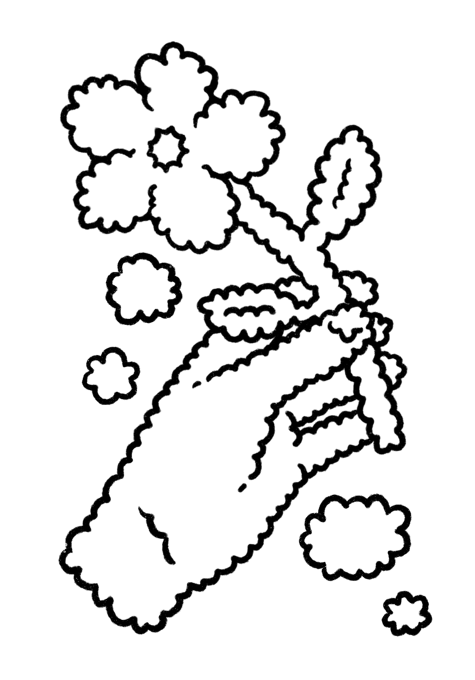
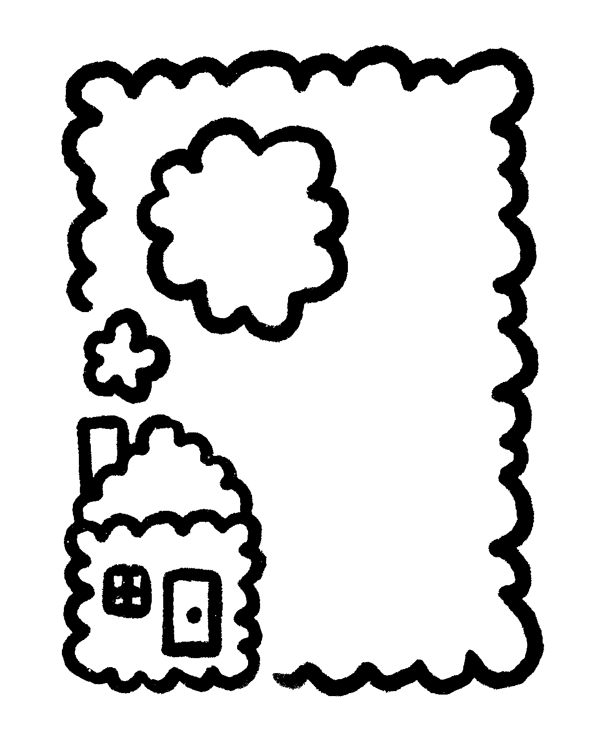
Next, we took on a more illustrative role and created graphics for the T-shirts that we would be printing and producing under the brand. The goal was to build on the sentiment of the "re-" words that we had come up with. We had a lot of flexibility and creative liberty in this next portion of the project. Here are the illustrations that I made for my shirts:


